Case Study
Condition Management Experience
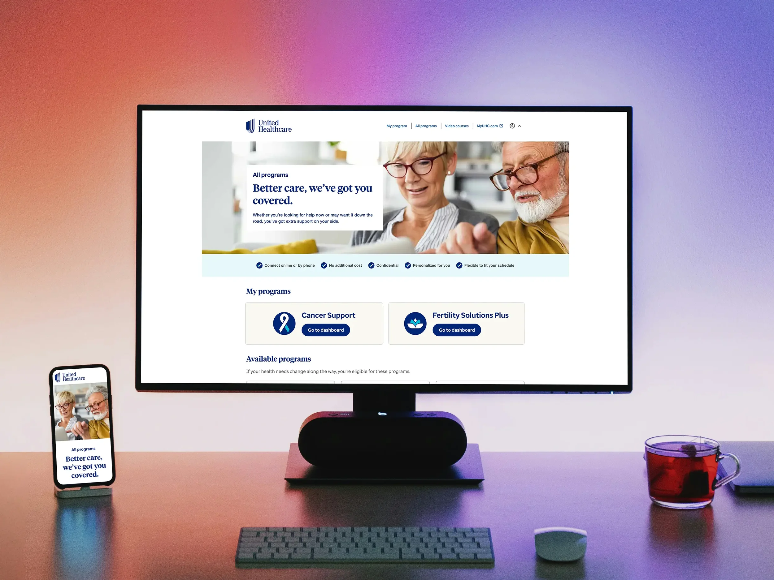
The Condition Management Experience is a multi‑condition support experience using a dual‑track product design approach: interactive dashboards where members actively manage ongoing care, and streamlined landing experiences where the goal is confident handoff into specialized support. For the dashboard‑driven conditions, I focused on personalized guidance—surfacing nurse connections, upcoming appointments, recommended actions, and curated learning in a way that reduces cognitive load and helps people stay engaged in their care. For conditions better served through external expertise, I created action‑oriented entry points that clarify benefits, set expectations, and guide members into the third‑party platform with minimal friction. Across both models, the design centers on clarity, reassurance, and momentum—meeting people where they are in their health journey and giving them the structure or support they need to move forward.
Disciplines & tools
Product strategy — defined the dual‑model experience (dashboards vs. landing flows) based on member needs and business goals.
User research synthesis — identified condition‑specific behaviors, emotional states, and care‑management patterns.
Journey mapping — mapped end‑to‑end tasks and decision points across multiple condition types.
Service design — aligned nurse workflows, clinical operations, and partner handoffs into a cohesive experience.
Competitive analysis — evaluated industry benchmarks and adjacent care‑management models to identify gaps, opportunities, and differentiators.
Interaction design — created modular components for actions, appointments, nurse connections, and learning content.
Cross‑functional collaboration — partnered with product, engineering, clinical teams, and third‑party vendors to ensure feasibility and alignment.
Accessibility design — ensured WCAG‑aligned patterns for readability, navigation, and assistive‑tech compatibility.
Challenge
The challenge was to design a unified condition management experience that could support very different health journeys while aligning input from multiple business teams, clinical partners, and cross functional teams. Each group brought its own priorities, care models, and operational constraints, which made it essential to create a consistent and scalable approach that worked across dashboards, landing flows, and external integrations. The experience needed to feel cohesive and intuitive for members whether they required ongoing high-touch guidance or a seamless transition into specialized support while maintaining a uniform design approach that reduced complexity and delivered clarity at every step.
Approach
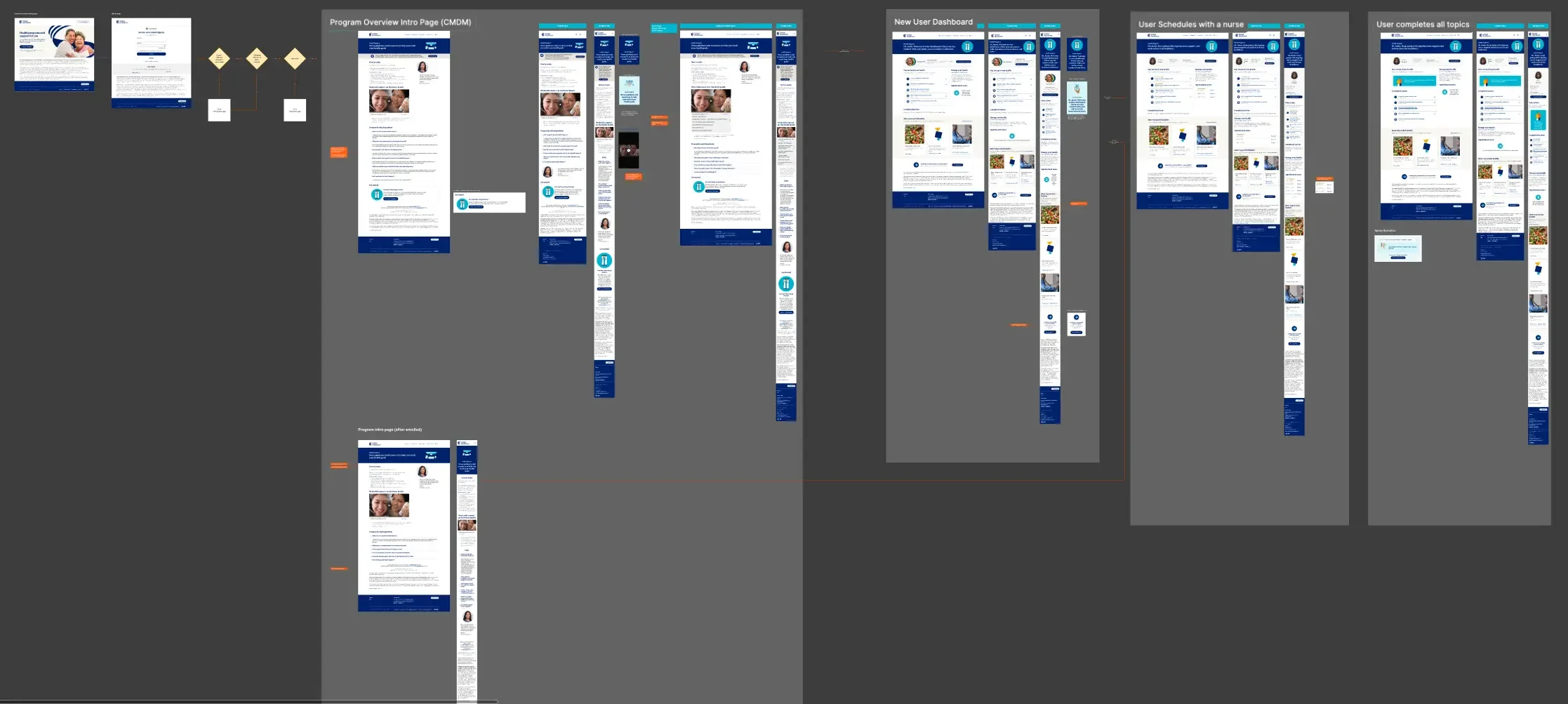
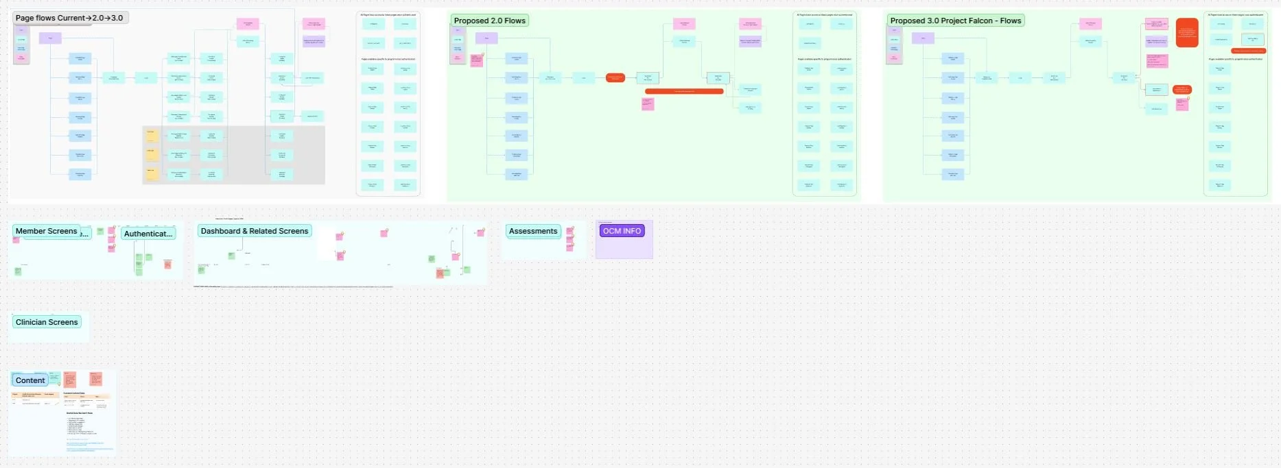
I approached this work by first grounding the experience in what we learned through clinician and subject-matter expert research. Through interviews with clinicians and SMEs, we uncovered how the current telephonic model functioned, where members struggled, and where digital touchpoints could create greater ease and convenience in their journey. These insights helped us understand the realities of each condition type and the moments when clinical support mattered most. With that foundation, I aligned multiple business groups around a shared vision for how the system should function and defined a dual‑model experience framework that separated high‑engagement conditions from those requiring a guided handoff. From there, I used journey mapping, workflow modeling, and content strategy to clarify what members needed at each step. I translated these insights into a unified digital experience that created consistency across dashboards, landing flows, and member journeys while preserving the clinical connection at the right moments.

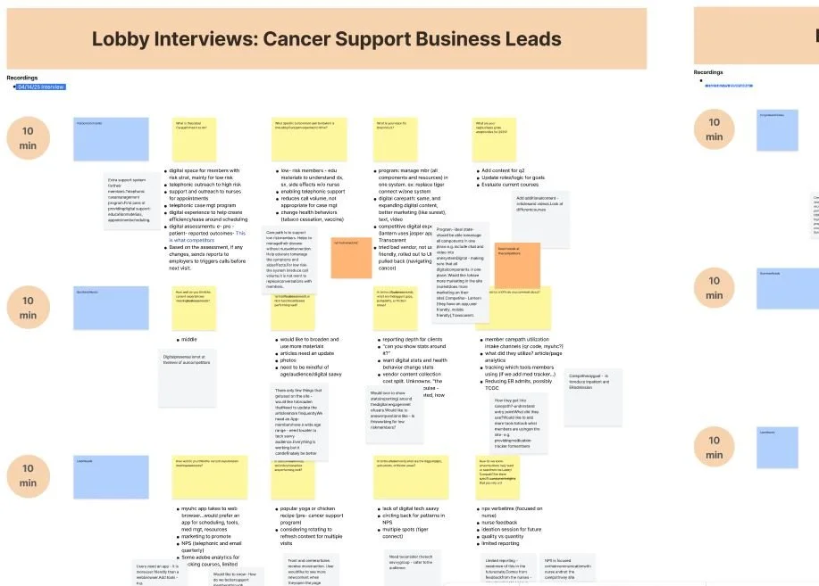
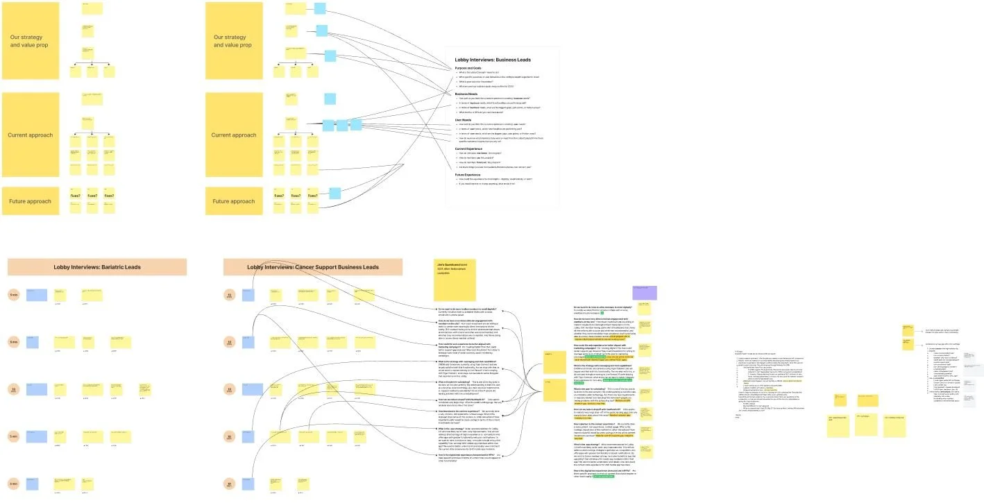
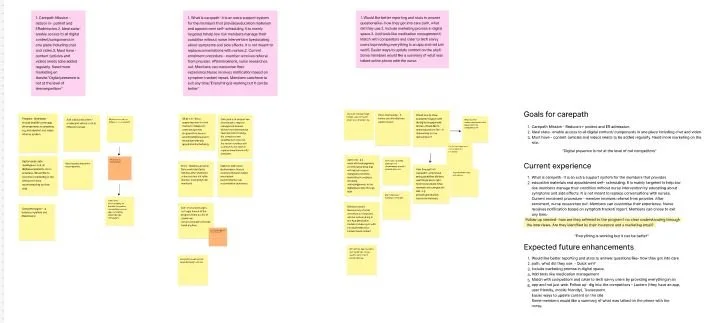
Gathering insights
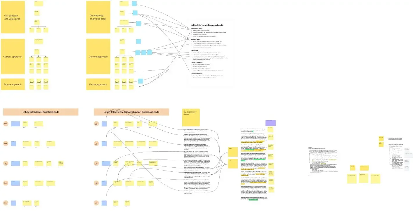
We conducted interviews with a half dozen clinicians and a half dozen subject‑matter experts to understand the current telephonic experience from the people closest to it. Our goal was to translate a historically phone‑driven enrollment and engagement model into a digital, self‑enrollment experience that still connected members with a clinician at the right moment in their journey. We grounded participants in our strategy, value proposition, business needs, and member needs, then probed deeply into the existing telephonic workflows to uncover pain points, opportunities, and behavioral patterns. From there, we synthesized the digital insights and opportunities into four core themes that shaped our decisions, informed our workflows, and guided how the new digital experience would support members more intuitively and effectively.

Enhanced Workflow
Utilizing user and stakeholder insights I mapped the enhanced workflow for users, reducing friction, increased repeat engagements and scheduled appointments with clinicians.
Theming & Tokenization
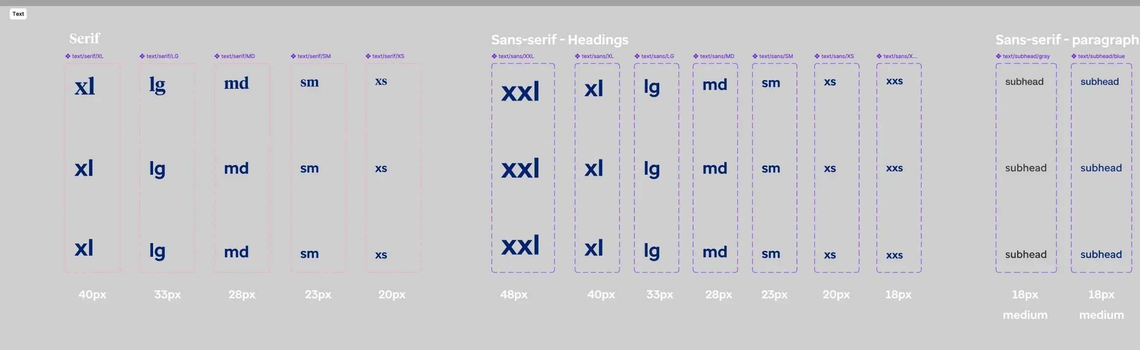
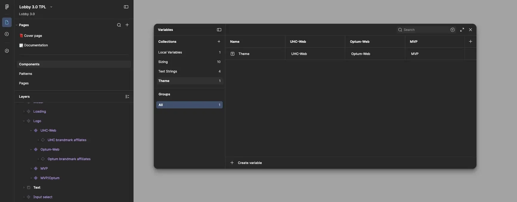
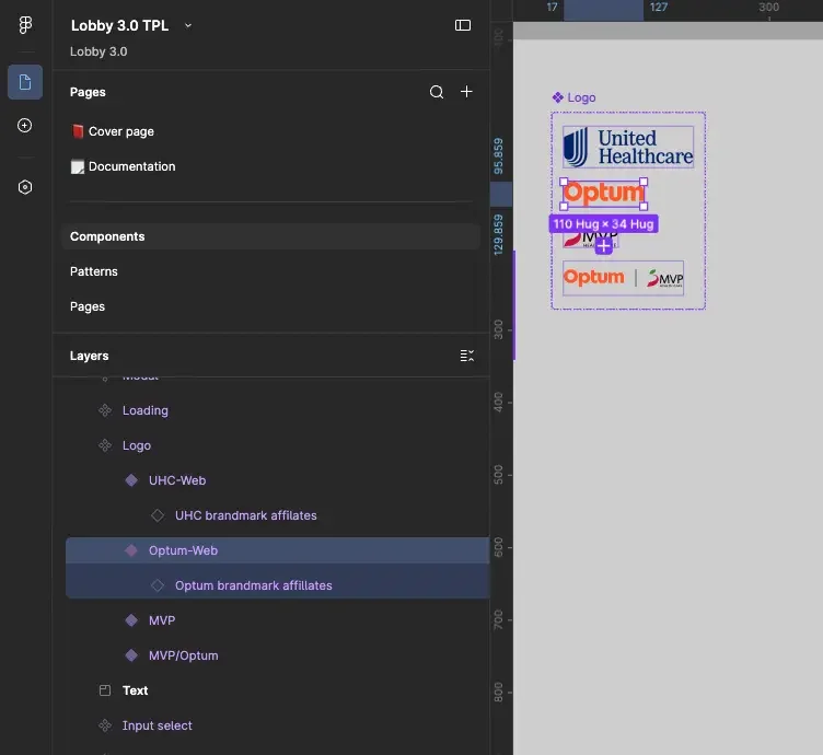
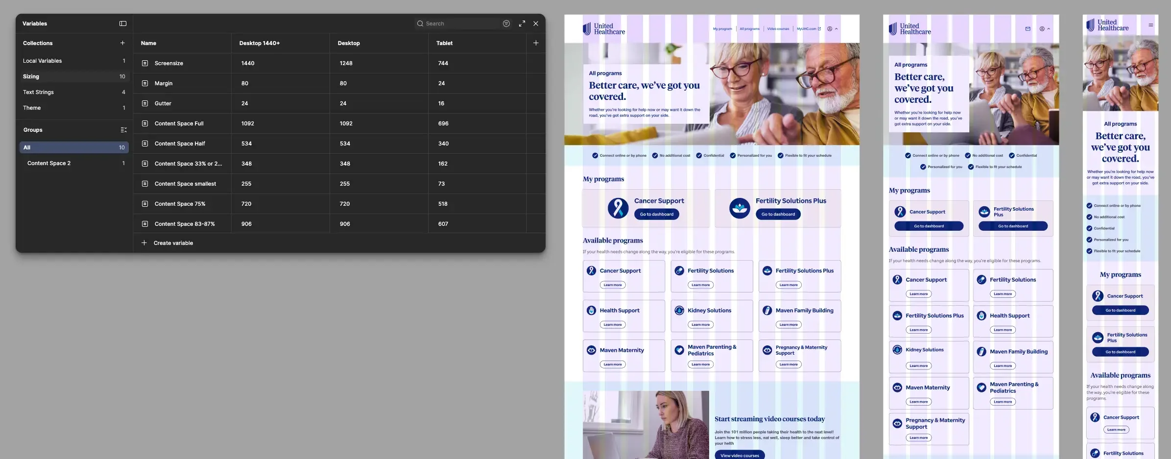
With so many programs to support and multiple product themes spanning UHC, Optum, and white‑label applications, each built on different design systems, it became clear that meticulous use of tokenization and Figma variables was essential. This approach allows the team to manage the complexity, maintain consistency across variations, and create an operational model that was sustainable and repeatable as the product grows and matures.
I built an abstracted pattern library that unified components from multiple design systems and included text styles, color tokens, illustrations, icons…etc., which allowed the team to scale theming efficiently and maintain consistency across every product variation.
Variant-based grid layout
By leveraging the power of variants and installed themes, I aligned components to the grid system in a way that kept layouts consistent and transitions seamless across all responsive breakpoints.