Case Study
Advocacy Experience
Optum Health
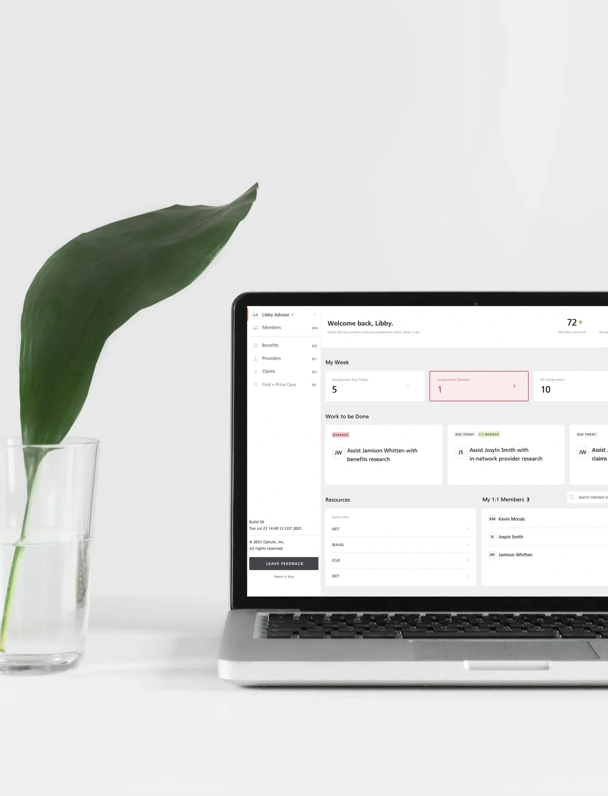
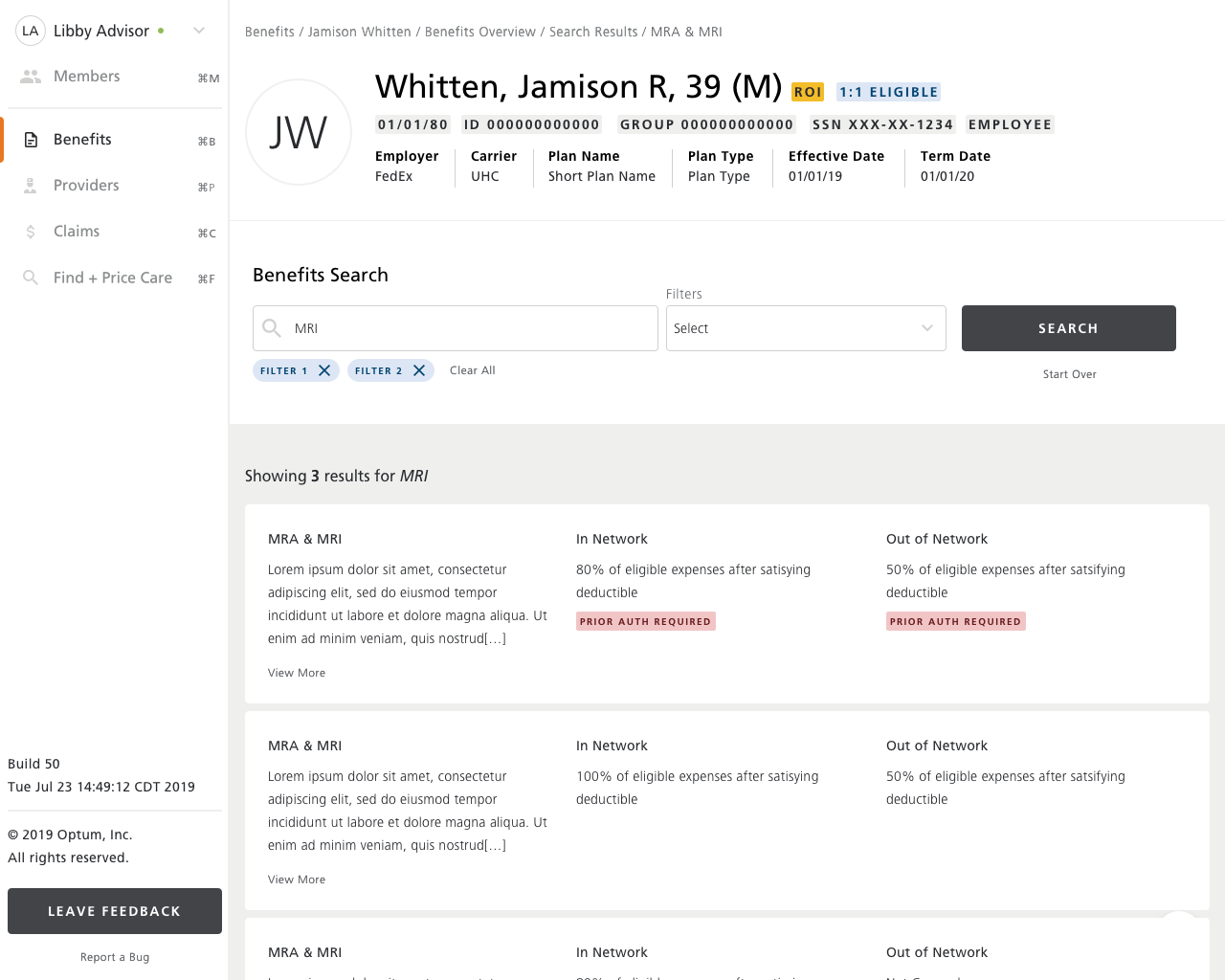
This work focused on defining a unified advisor experience that streamlines workflows, reduces friction, and helps advisors have clear, well‑informed conversations with members. Through product strategy, experience architecture, and service design, I married user and operational insights into a clear set of advisor needs: a centralized workspace, complete member context, and fast access to decision‑critical data across benefits, claims, and financials.
Using workflow modeling and information architecture, I shaped the foundational interaction patterns that reduce cognitive load and support real‑time decision‑making. These insights informed a modular, scalable UI framework aligned with enterprise design systems and built for future product .
I partnered closely with product, engineering, and clinical teams to ensure feasibility, accuracy, and compliance. This case study highlights how strategic UX leadership can unify fragmented tools, elevate advisor effectiveness, and create a durable foundation for guided experiences across the ecosystem.
Disciplines & tools
User research synthesis — based on observing advocates in action as they navigated systems, triaged needs, and assisted members.
Experience architecture — structured how advisors move across tasks, data, and tools.
Service design — aligned advisor workflows with operational processes and support models.
Workflow modeling — mapped end‑to‑end advisor tasks and decision points.
Information architecture — organized data, actions, and navigation for clarity and speed.
Interaction design — defined patterns that reduce cognitive load and support real‑time decisions.
Systems thinking — ensured modularity, scalability, and fluidity across the platform.
Accessibility design — ensured inclusive, compliant patterns across the experience.
Cross‑functional collaboration — partnered with product, engineering, and clinical teams to ensure feasibility and accuracy.
Challenge
Advocates need to field a wide variety of member questions and concerns, often in fast‑moving situations, so getting to the right information quickly and effortlessly is essential. The existing ecosystem made this difficult because advisors were navigating multiple tools, inconsistent data sources, and disconnected workflows, which slowed them down and made it harder to support clear, well‑informed conversations with members. As we examined how advisors move through their day, it became clear they needed a more unified and intuitive experience that brought tasks, member context, and benefits, claims, and financial information into one place. The work required simplifying complexity, reducing cognitive load, and creating a scalable foundation that could support more effective guidance.
Approach
I designed a more unified and intuitive experience that brings the most important information and actions into one place, making it easier for advisors to find what they need without jumping between tools. The structure was simplified so benefits, claims, financial details, and member context are easier to access and understand, supporting clearer and more confident conversations. We introduced consistent patterns and components that reduce the mental effort required to navigate the system, helping advisors work faster and more comfortably.


Research insights
When I joined the company, the initial research had already been conducted, but I was able to participate in several key observational sessions with advocates. These sessions allowed me to watch advocates work in real time, understand how they field and assess a wide range of member questions, and see where their tools supported them and where they created friction. Observing their workflows firsthand helped me identify moments of hesitation, unnecessary steps, and areas where information was difficult to locate or interpret. The sessions also revealed opportunities to streamline how advocates move between tasks, clarify what should happen next in a conversation, reduce repetitive actions, and better support the transition between answering questions, providing information, and determining whether a handoff was needed. These insights shaped the foundation for a more intuitive and efficient experience that aligns with how advocates naturally think and work.
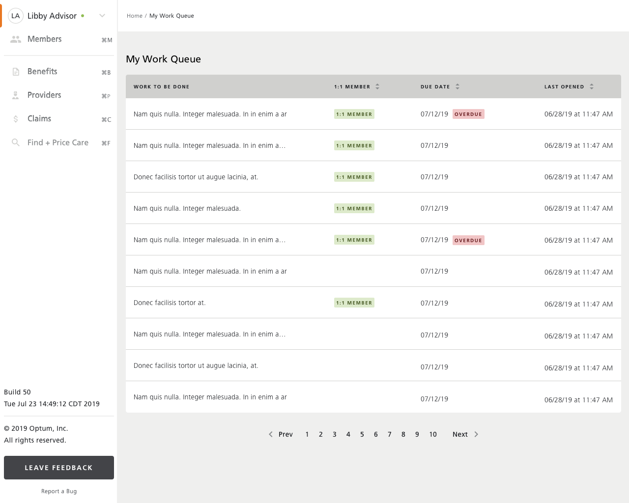
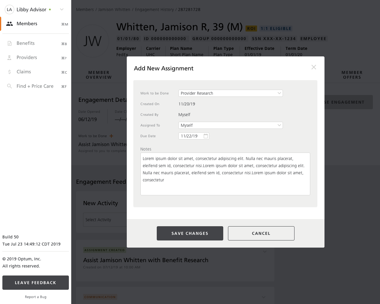
Streamlined workflow & User Interface
I focused on how advocates had to jump between different systems and UI patterns just to complete a single task. Each tool worked a little differently, required its own steps, and surfaced information in its own way, which slowed advocates down at the exact moments they needed to keep up with a member’s questions. Addressing these hurdles, I shaped a more consistent, streamlined workflow that reduces context‑switching, brings key details forward, and helps advocates stay aligned with the pace of the conversation.
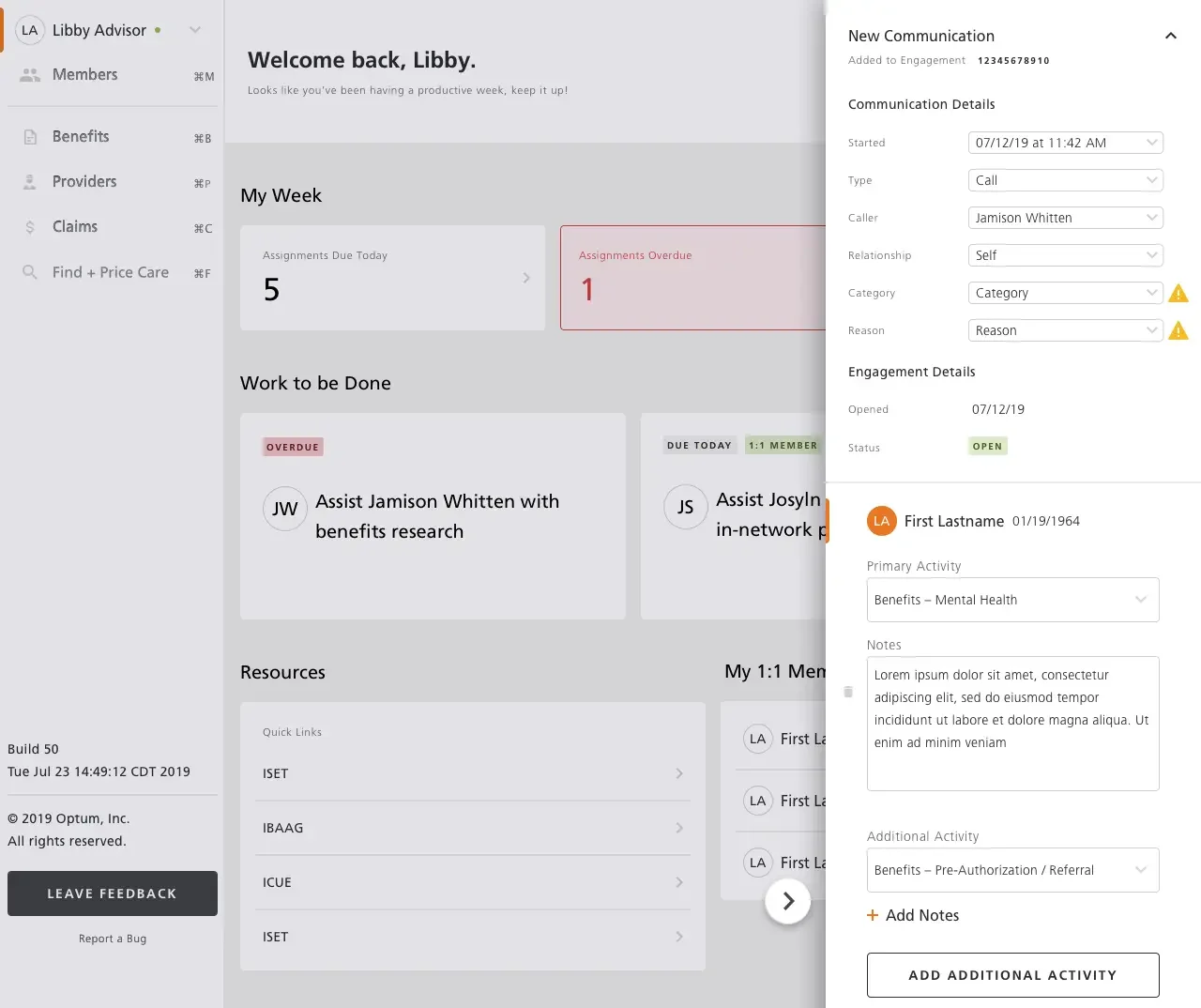
Communications & Reporting
Prior to the new experience, notes were inconsistent from person to person, often missing key details, and buried inside an outdated system that made them difficult to find or use. That inconsistency also meant teams couldn’t reliably report on trends or understand what was happening across interactions. The new communication panel brings structure and uniformity to how information is captured, guiding advocates through what needs to be recorded while reducing variation, improving accuracy, and giving the organization consistent data and reporting